Natural, Black, White, Denim, or Navy: Best Tote Bag Color for Mockup Photos
Bag color isn't a background choice the way a mockup's scene or setting is — it's a physical part of what you're selling, and it directly affects whether a design is even legible in the photo. The wrong bag color can make a great design look faint or muddy; the right one makes the same design pop without changing a single pixel of the artwork itself.
The one rule that matters most: contrast
Before brand vibe or aesthetic preference, contrast decides whether a design actually reads in a mockup. A light design on Natural or White canvas, or a dark design on Black or Navy, loses definition — sometimes badly enough that buyers scroll past without registering there's a design there at all. Start every color decision from contrast, then layer style preference on top.
| Bag color | Reads as | Works best for |
|---|---|---|
| Natural | Classic, unbleached, versatile | The safest single default — the "tote bag" most buyers already picture, works with most design colors |
| White | Clean, bright, high contrast for dark ink | Bold black line art, photography-style prints, minimalist single-color designs |
| Black | Bold, high contrast for light ink | Designs with white, pastel, or metallic-style colors; streetwear or graphic aesthetics |
| Denim | Textured, casual, a step past plain canvas | Vintage, retro, or hand-drawn designs that want visual texture behind them |
| Navy | Muted, slightly dressier than black | Designs that want contrast without black's starkness — nautical, outdoorsy, or understated themes |
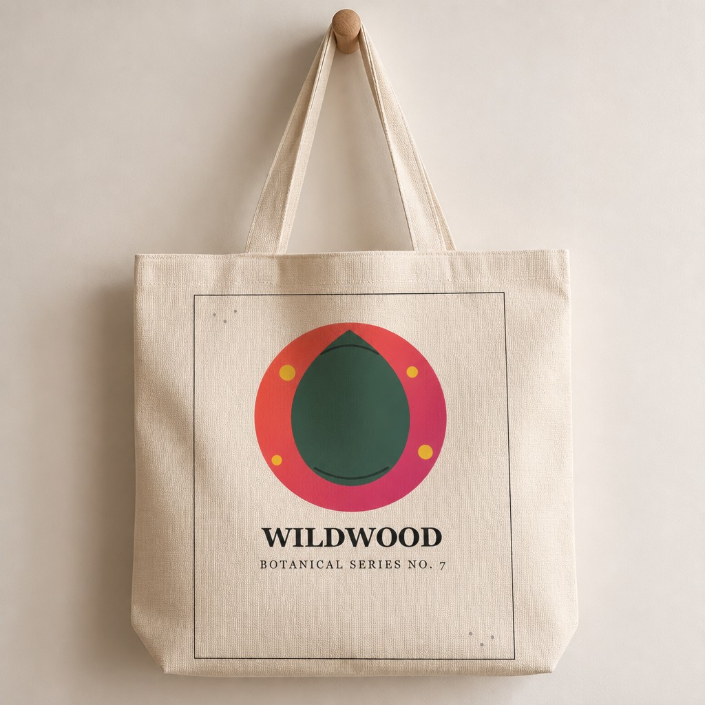
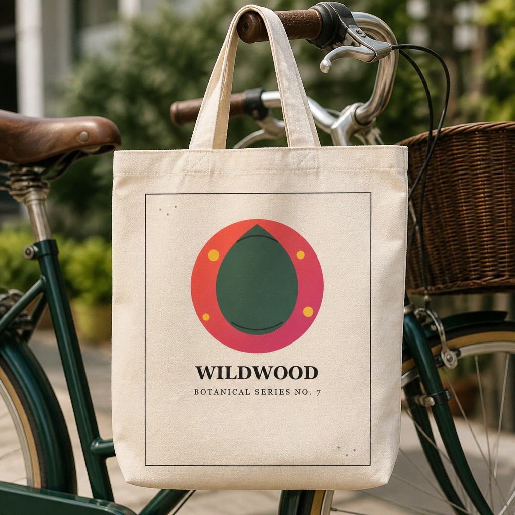
The same design can read completely differently depending on the bag color behind it.
Choosing a color for your specific design
Identify your design's dominant tone
Is it mostly dark ink, mostly light ink, or a mix? This decides which bag colors will actually create contrast rather than fight your design.
Generate 2–3 candidates, not just one
Contrast rules are a starting point, not a guarantee — the fastest way to know for sure is to generate the actual mockup and look at it.
Pick your lead photo color to match your default variant
Whichever color you list as the default (usually the one most buyers pick), that's what your primary listing photo should show.
Mock up every additional color you actually offer
If color is a selectable variant, generate each one — buyers choosing a color should see it before buying, not guess from a swatch.
Accuracy still applies: bag color is a real product attribute, not styling. Never show a color in your lead photo that isn't actually your default listing variant — a buyer expecting the pictured color to arrive is the most avoidable kind of support message.
Color and scene work together
Bag color isn't the only variable — the scene it's shot in matters too. A Natural tote reads differently hanging on a hook than it does carried on a city street. If you're also deciding between Hanging, Flat Lay, Held, Chair, or Market scenes, pick color first (it's the harder constraint, since it has to match what you actually sell), then choose whichever scene shows that color and design clearest. See our guide on which tote bag scene sells best for the scene side of that decision.
Compare your design across all 5 tote colors
Upload once and generate Natural, Black, White, Denim, and Navy mockups to see which actually fits your design best.
Try free — no account needed →Natural, Black & White free · Denim & Navy on Pro
Frequently asked questions
What's the safest default tote color if I only pick one?
Natural — the unbleached canvas look is what most buyers picture when they search "tote bag," and it's neutral enough to not fight with most design colors.
Should the mockup color match what I actually sell?
Yes, always. Bag color is a real physical attribute of the product, not a styling choice like a poster frame — if your listing's default variant is Black, your lead photo should be Black, not a color you don't actually offer.
Can light designs work on light bags?
Generally no, unless the design uses bold outlines or dark fills that will still show up against Natural or White canvas. A pale design on a pale bag often reads as washed out in a listing photo — the mockup should reflect that reality, not hide it.
Can I generate my design across all 5 colors to compare?
Yes — Natural, Black, and White are available free, and Denim and Navy are available on PosterMock AI's Pro plan, all generated from the same uploaded design.